Miami Marlins uniforms are the soul of the team
PHOENIX, ARIZONA – JUNE 13: Ketel Marte #4 of the Arizona Diamondbacks bats against the Los Angeles Angels during the MLB game at Chase Field on June 13, 2021 in Phoenix, Arizona. (Photo by Christian Petersen/Getty Images)
Now, onto more modern baseball times as we take a look at the Arizona Diamondbacks and the Florida/Miami Marlins. The 1990’s were a time of exponential growth in the MLB with the addition of four expansion teams to reflect the population growth and migration southward and with westward in the United States. I lived in the 1990s’ and even though I wasn’t into the more neon color schemes of that time era ( I was actually on active duty in the U.S. Army so the only color to me was green), expansion cities tried to convey new, exciting color schemes to generate instant fan interest.
The Arizona Diamondbacks and Miami Marlins came into the MLB to make an immediate uniform splash.
The Arizona Diamondbacks joined the Show in 1998 and immediately went to the purple, teal,
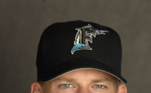
26 Feb 2002: A.J. Burnett #43 of the Florida Marlins is pictured during the Marlins media day at at their spring training facility in Viera , Florida. DIGITAL IMAGE.
black and copper look that just conveys . . .nothing about the desert. I grew up in the desert and I can assure you I’ve never seen a purple, teal and black copperhead but the colors instantly identified the D-Backs. Of course, winning a World Series in 2001 put them on the map but what has happened to the purple, teal, black and copper team colors? Well, the baseball marketing gurus have come up with ways to make those colors “turn back the clock” and sell them as retro. The D-backs have moved on to more southwestern desert-looking colors but have yet to garner any real true identity through their uniforms and logos.
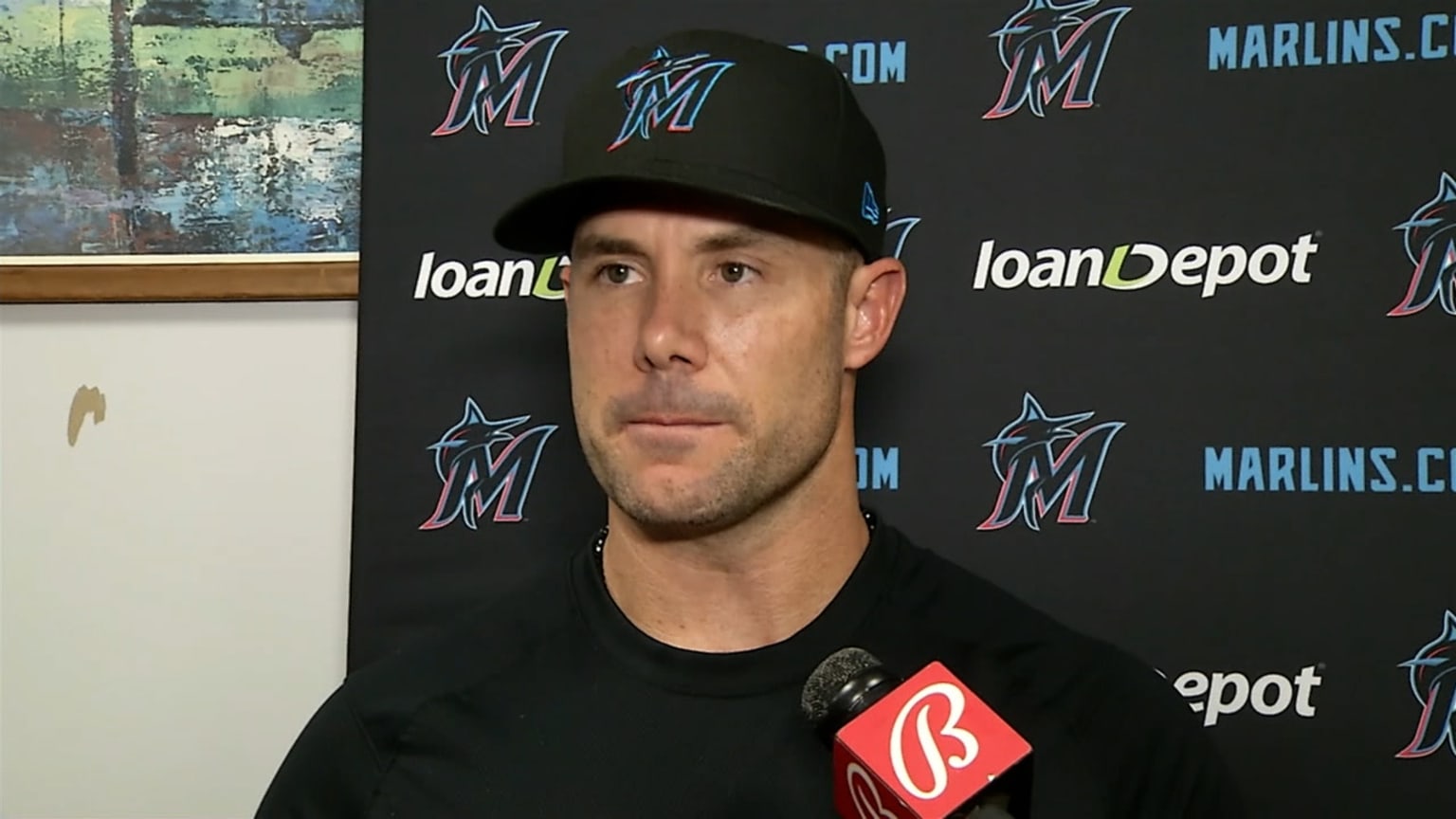
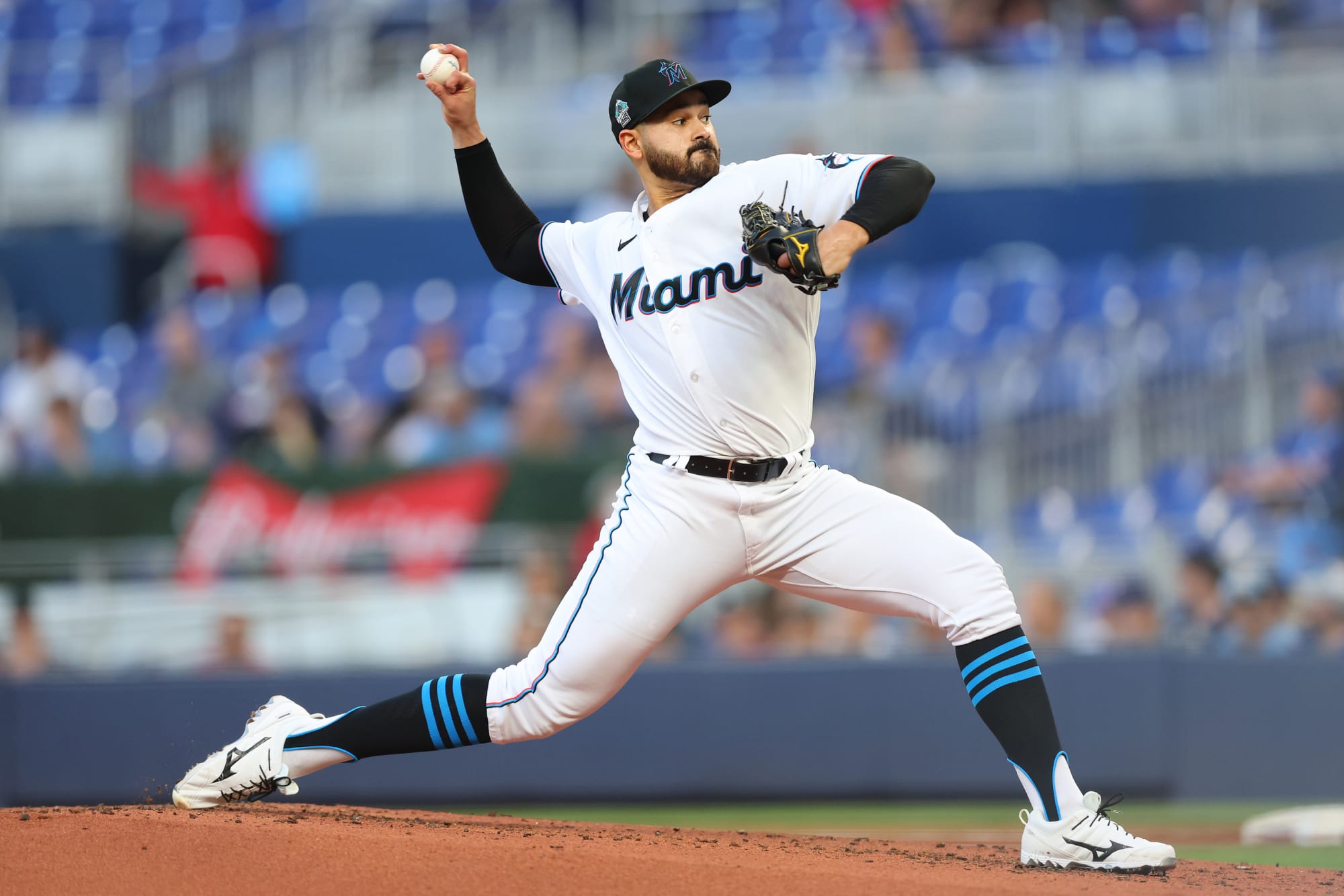
The Florida Marlins made a literal splash into south Florida in 1993 and immediately were recognizable based on those teal and black uniforms – lots of teal and black with the jumping marlin logo. Lo and behold, the Marlins won the World Series in 1997 and of course what happened? The entire team was basically sold off in a fire sale. Slowly but surely, the Marlins ownership began to move the teal out and the black color scheme in more and more until bang – the Florida Marlins became the Miami Marlins. The Miami version of this team no doubt was designed to create a local flair and a local fan base in south Florida towards their local team.
I got used to the Marlins newer color scheme looking like some sort of tropical cocktail and then it happened again – the Miami Marlins changed their colors to black, cool blue and some sort of red that I’m not sure about but I bet that Crockett and Tubbs would give them a thumbs up. Successful teams spend precious little time changing their uniforms and logos; teams in search of an identity are always finding ways to come up with the newest and greatest color and logo combinations. This phenomenon isn’t just isolated to MLB; how many NFL teams keep changing up their looks? The NBA has plenty of teams changing up their identities every decade or so.
My argument is simple: consistent uniforms and logos build brand identity and a sense of fan ownership. Changing up looks makes fans wonder what’s wrong with this team?