Two Graphs Give Insight Into The Housing Market Present And Future
stu99/iStock via Getty Images
Recent monthly house price data shows a dramatic change in pricing trends.
The boom is over.
House prices have been increasing for the past decade providing a source of wealth to homeowners and continued income to the real estate industry. Over the past two years, we have been in an explosive housing price bubble, with prices rising far faster than long-term trends.
Recent data shows that the trend has reversed, with monthly pricing data from the 20 major markets showing declines in each of the four months through October. With monthly sales contract volumes down and economic conditions not improving, we can assume that November and December will also show monthly price declines as well.
I have been surprised in conversations that many are unaware that the price trend in housing has changed. We have been lulled into thinking that house prices are continuing upwards by the way headline data is presented in the media.
An issue with the housing data that we see quoted in the news is that it is annualized year-over-year data. At times like now, when the trend is changing from a huge explosion in prices to price declines, the annual data takes, well, you guessed it, about a year to show the real situation. By looking at monthly data, we can now see that the trend has changed, and prices are now declining across the country.
Below are two graphs that can provide insight into what is happening in the housing markets now, as well as showing a prior period as an example of where we might be headed.
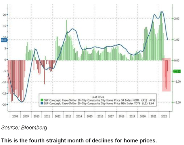
The first graph tells the story – the fourth straight month of housing prices declining in the top 20 U.S. markets. No, it is not only in cities on the other side of the country as you might wish to believe.
In this graph, the blue line is the annual year-to-year data – so it looks like prices are still rising even though the price rise is slowing down.
The vertical bars are the monthly data. You can see that prices across the top 20 metro areas are down in all of the last 4 months (red bars through October). November and December will show declines as well given what we know about the increases in inventory and decreases in signed contracts (supply higher/demand lower = lower prices: econ 101).
zerohedge.com
But there is more to see in the chart above. First, that prices have been rising for a decade – our minds have programmed us to thinking that they always go up. Second, that prices have exploded in an unusual bubble since Covid arrived in February 2020. Also, go all the way back to 2008 and see how prices declined for many months back then after the housing bubble of the mid-2000’s. By comparison, we are only at the beginning of the housing price readjustment (crash).
The second graph, below, provides some great long-term insight.
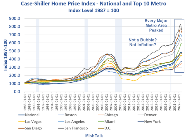
This is showing the long-term trends in annualized year-over-year price.
On the right side of the graph, note that the peak pricing has been reached in all the metro areas.
Also note the huge price explosion in 2020-21. The steep slope of the lines makes it clear that this behavior and trend is not normal.
For a reality check, the population of the U.S. did not explode after 2018 causing a “need” for more housing. This house demand and house price explosion was about migration, rock-bottom mortgage interest rates, and access to $8+trillion in free government handouts and corporations buying homes. Now, with the job market changing, the handout money getting spent, and mortgage costs higher, demand would be expected to decline – meaningfully. (Use of crypto to buy homes In Miami and some other markets was notable, so with crypto cratering, so goes another source of demand.)
mishtalk.com
This graph provides a view of what happened in the last housing bubble/crash. Yes, I know, some say that this time is different because there was some fraud involved in the 2008 funding of housing. But it was the same thing – a rush to buy because fear of missing out, fueled by low interest rates – both factors present in 2020-21, followed by the mortgage market freezing up (as is happening now, so my real estate comrades tell me), and the economy cooling then and now. In both periods the builders and flippers scrambled, people bought second and third homes, and then were stuck with inventory – some with variable-rate mortgages that cost them much more as rates increased. So, no real difference.
Maybe the last housing bubble can be an example of what we might expect to come to us now. The peak occurred before the recession in 2008 (blue-grey area on the graph). Note that all the prices came down to about the same index level, thus the high-flyer metros dropped the most, but all markets right-sized to longer trend. And note that the downtrend took 2-5 years.
The question today: what is going to happen to the real estate market this time around?
We don’t know, and I hope that the economy does not destabilize into another big recession. We do know that, going back over decades of experience, bubbles pop and longer trends revert. This time around we have just begun – 4 months of decline.
Now look at the dark blue National line from 2012 to 2020 and project it to today. That is the level that we may see all these markets head toward. Also note that this level, around 400, is essentially a linear extension of long 34-year trend.
If this bubble pops like the 2006-12 period, we are in for a long real estate adjustment. If it doesn’t pop, then we have embedded a very significant increase in the cost of living for all.


